Want to match your consent banner’s look and feel to your brand? WPConsent’s Style tab gives you full control over colors, font size, and button appearance. This guide walks you through customizing every visual detail of your banner styling.
Table of contents
- Prerequisites
- Opening the Style tab
- Setting the banner background and text colors
- Choosing a font size
- Configuring button size
- Setting the button corner radius
- Choosing the button type
- Customizing individual button colors
- Saving your changes
- Verifying your setup
- FAQ
- Conclusion
Prerequisites
- WPConsent is installed and activated on your WordPress site.
- You have administrator access to the WordPress dashboard.
- You’ve already chosen a banner layout on the Layout tab (see Banner Layout Options).
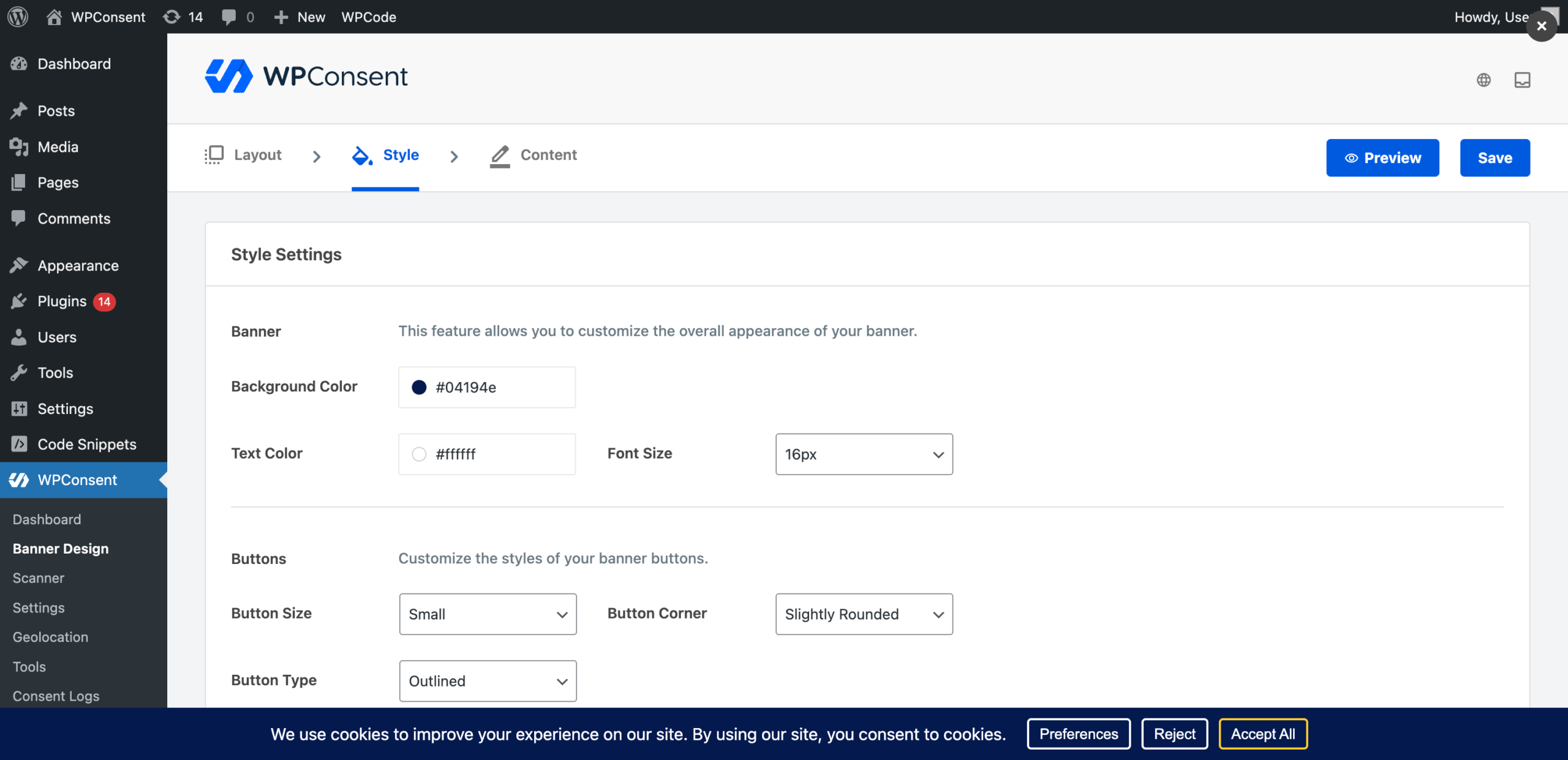
Opening the Style tab
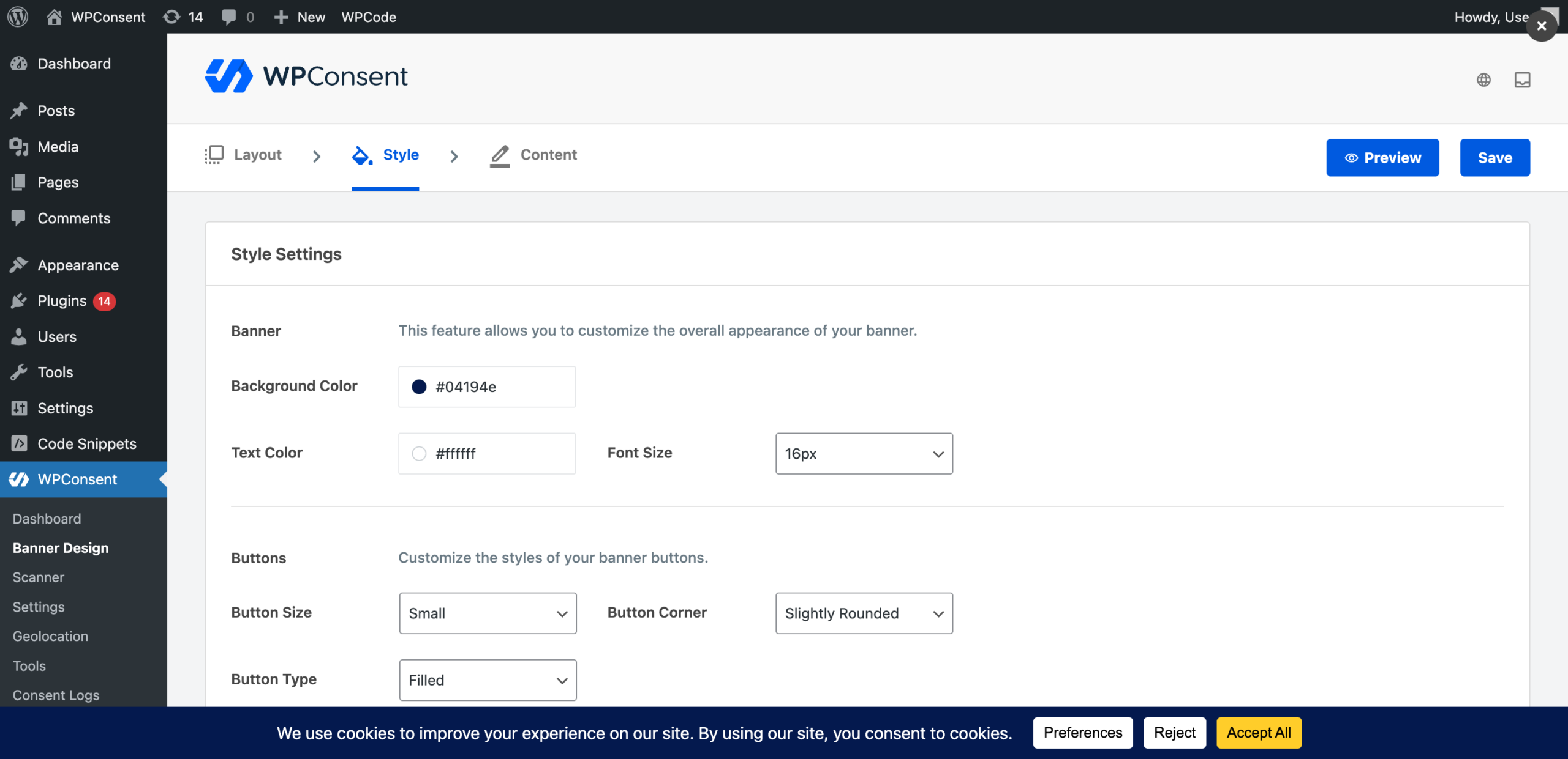
To get started, navigate to WPConsent >> Banner Design and click the Style tab at the top of the page.
Every change you make on this tab updates the banner preview at the bottom of the page in real time, so you can experiment with colors and button styles and see the result instantly without saving first.
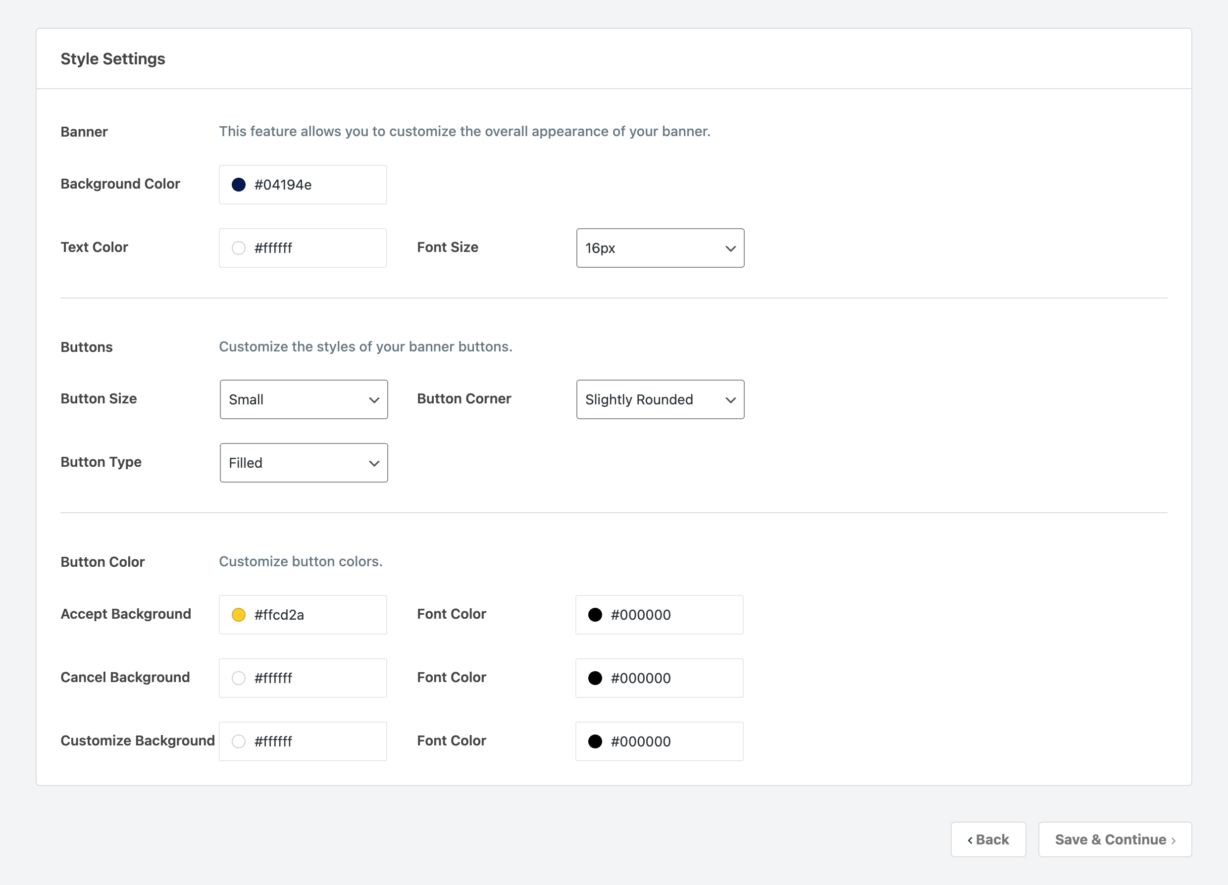
Setting the banner background and text colors
The first section is labeled Banner and contains 2 color pickers.
- Background Color controls the banner’s background. The default is
#FFFFFF(white). - Text Color controls the color of the message text. The default is
#000000(black).
Click a color swatch to open the color picker. You can type a hex value directly or use the visual picker to select a color.
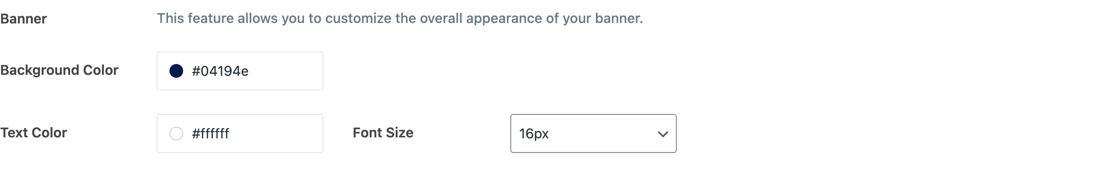
Choosing a font size
Next to the color pickers, you’ll find a Font Size dropdown. Select a value between 12px and 30px (in 2px increments). The default is 16px.
Available sizes: 12px, 14px, 16px, 18px, 20px, 22px, 24px, 26px, 28px, and 30px.
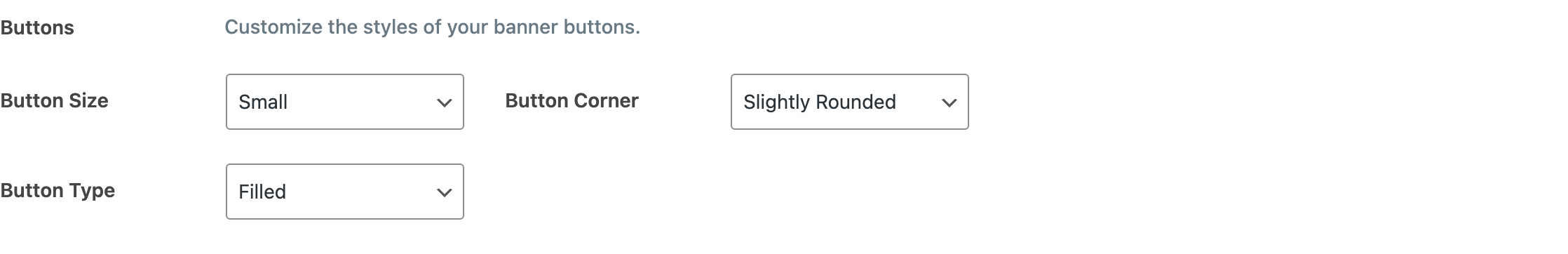
Configuring button size
Scroll down to the Buttons section. The Button Size dropdown offers 3 options:
| Value | Description |
|---|---|
| Small | Compact buttons with less padding. |
| Regular | Standard-sized buttons. This is the default. |
| Large | Buttons with extra padding for higher visibility. |
Setting the button corner radius
The Button Corner dropdown controls how rounded the button edges are:
| Value | Description |
|---|---|
| Square | No border radius. Buttons have sharp 90-degree corners. |
| Slightly Rounded | A subtle border radius for a softer look. |
| Rounded | A fully rounded border radius. This is the default. |
Choosing the button type
The Button Type dropdown determines whether buttons are filled or outlined:
| Value | Description |
|---|---|
| Filled | Buttons have a solid background color. This is the default. |
| Outlined | Buttons have a transparent background with a colored border instead. |
When you select Outlined, the button background color settings act as border color settings instead.
Here’s how the 2 button types look in the banner preview. The Filled style gives buttons a solid background color:
The Outlined style replaces the solid background with a colored border, keeping the button interior transparent:
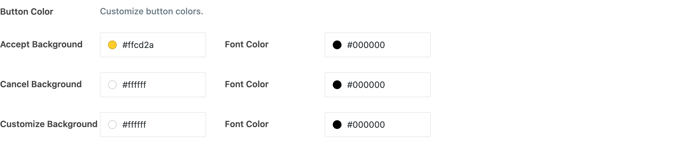
Customizing individual button colors
Below the general button settings, you’ll find a Button Color section with color pickers for each of the 3 buttons.
Accept button:
- Accept Background is the fill color (or border color if outlined). Default:
#E8B13A. - Font Color is the text color on the Accept button. Default:
#FFFFFF.
Reject button:
- Cancel Background is the fill color (or border color if outlined). Default:
#FFFFFF. - Font Color is the text color on the Reject button. Default:
#FFFFFF.
Preferences button:
- Customize Background is the fill color (or border color if outlined). Default:
#04194E. - Font Color is the text color on the Preferences button. Default:
#FFFFFF.
If you’ve enabled the floating settings button, you’ll also see a Floating Settings Button Design section at the bottom of this tab. For details on configuring its icon, see the floating consent button guide.
Saving your changes
Click Save & Continue to save and move to the Content tab. Alternatively, click Save in the top-right corner to stay on the current tab.
Verifying your setup
- Check the banner preview at the bottom of the page. It reflects every change in real time, so you can confirm your colors, font size, and button styles look correct before saving.
- After saving, open your site in a new incognito or private browser window.
- Confirm the banner displays the background color, text color, and font size you chose.
- Verify the button size, corner radius, type, and colors match your settings.
FAQ
Why don’t my color changes appear on the frontend?
Clear any page caches and reload the site. If you use a caching plugin, purge its cache after saving banner settings.
Why does the outlined button style look the same as filled?
When you switch from Filled to Outlined, the background color setting becomes the border color. If both the background and border were the same color, the visual difference is subtle. Try setting a distinct border color to see the outlined effect clearly.
Why doesn’t changing the font size affect my buttons?
The font size setting controls the body text in the banner message area. Button text size scales proportionally with the Button Size setting, not the font size dropdown.
Conclusion
You’ve now customized the visual style of your consent banner, from background colors and font size to button shapes and individual button colors. All changes are reflected in the live preview before you publish them. To continue setting up your banner, learn how to edit the message and button labels in our guide on customizing banner content text.