
Would you like your cookie banner to match your theme more closely than the Style view can manage on its own? All you need is a place to put a few lines of CSS.
This guide walks through the CSS custom properties WPConsent exposes for its consent interface, and shows you what each one changes.
Table of contents
- How Does WPConsent Expose Its Banner Styles?
- Finding the Values Your CSS Overrides
- Restyling the Consent Banner
- Restyling the Preferences Panel
- Restyling the Floating Settings Button
- Matching Your Blocked Content Placeholders
- Looking Up Every Available Property
- Frequently Asked Questions
Before you get started, make sure WPConsent is installed and activated on your WordPress site.
How Does WPConsent Expose Its Banner Styles?
WPConsent draws its consent interface inside a self-contained container called a shadow root. That container has its own private stylesheet, which is what keeps your theme from accidentally restyling the banner and keeps the banner from restyling your theme. It also means an ordinary theme rule such as .wpconsent-banner { background: black } never reaches the banner at all.
The supported way in is a set of CSS custom properties. WPConsent reads its colors, spacing, corners, and type sizes from these properties, so setting one from your own stylesheet changes the banner without touching the plugin. Every property is named with a --wpconsent- prefix.
They all resolve against a single element, the container with the ID wpconsent-container, and that is the selector to target:
#wpconsent-container { --wpconsent-background: #101820; }
Targeting that container matters, because it is the one place where a plain rule wins with no !important needed. Rules written against :root or html look like the obvious choice and quietly do nothing to the banner, since WPConsent sets its own values further down the page than that.
Note: Custom properties cascade, so one rule on #wpconsent-container covers the consent banner and the preferences panel together. The floating settings button and your blocked content placeholders each need their own rule, which the sections below cover.
Where you put the rule is up to you. Your child theme’s stylesheet, Appearance » Customize » Additional CSS, or a CSS snippet plugin all work. Our guide on customizing the banner with CSS goes through the options.
Before writing a rule, it is worth knowing which of the properties already carry a value you chose yourself.
Finding the Values Your CSS Overrides
To get started, we’ll map the banner designer’s color fields onto their property names. Most of the color and type properties are the settings you already saved there, published as CSS, so a rule that changes one is really a rule that overrides a field you can see.
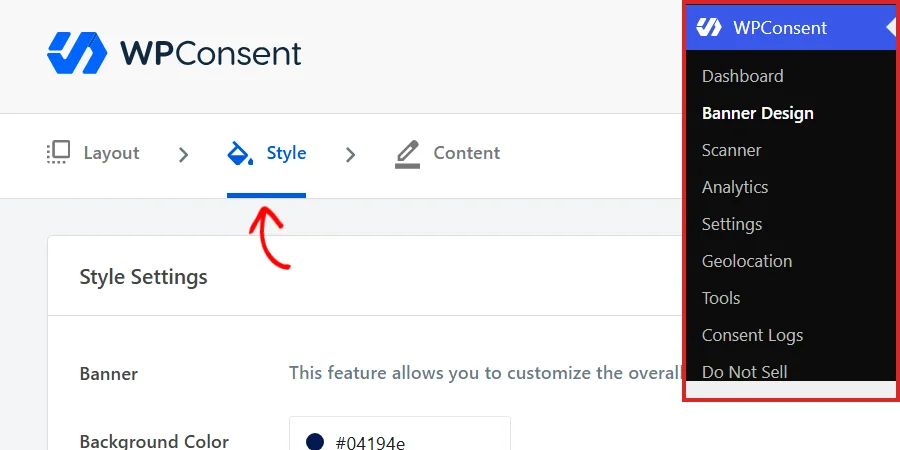
From your WordPress admin sidebar, go to WPConsent » Banner Design, then open the Style tab.
The Button Color section near the foot of this panel holds the values behind the button properties.
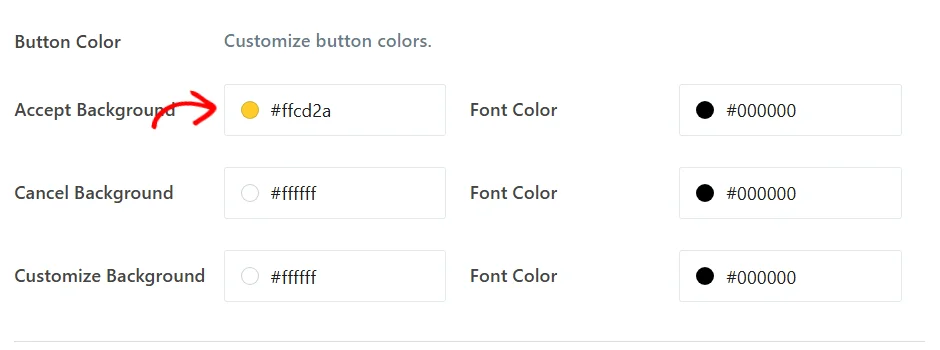
Each field maps to one property:
--wpconsent-accept-bgand--wpconsent-accept-colorcome from Accept Background and its Font Color.--wpconsent-cancel-bgand--wpconsent-cancel-colorcome from Cancel Background and its Font Color.--wpconsent-preferences-bgand--wpconsent-preferences-colorcome from Customize Background and its Font Color, which is the preferences button.--wpconsent-background,--wpconsent-text, and--wpconsent-font-sizecome from the Banner section higher up the same panel.
Our guide on banner styling covers this panel in full. With the mapping in hand, you can start overriding it.
Restyling the Consent Banner
The banner is the surface most people want to change first, and it responds to two groups of properties: one for color, one for shape and type. Here is the banner as WPConsent draws it before any custom CSS, so you have something to compare against.

Changing the Colors
The banner’s palette comes from the panel background and text, plus a background and a text color for each button. Setting them together is what keeps a restyled banner looking deliberate rather than half-converted.
#wpconsent-container {

  --wpconsent-background: #101820;

  --wpconsent-text: #f3f4f6;

  --wpconsent-accept-bg: #f8b500;

  --wpconsent-accept-color: #101820;

  --wpconsent-cancel-bg: #2b3a46;

  --wpconsent-cancel-color: #f3f4f6;

  --wpconsent-preferences-bg: #2b3a46;

  --wpconsent-preferences-color: #f3f4f6;

}
That rule turns the same banner into a dark panel with a single highlighted action.

Both groups of properties can go in the same rule, and the second group is where the settings run out.
Changing the Shape and Type
The second group governs geometry: corner rounding, the drop shadow, internal spacing, how wide the panel gets, and the type. None of these has an equivalent field in the Style view, so CSS is the only way to reach them.
#wpconsent-container {

  --wpconsent-border-radius: 0;

  --wpconsent-shadow: none;

  --wpconsent-padding: 24px 32px;

  --wpconsent-min-width: 640px;

  --wpconsent-font-size: 17px;

  --wpconsent-line-height: 1.7;

}
The result is a square-cornered, flat, roomier panel.

--wpconsent-min-width sets the narrowest the panel is allowed to be, and the panel still grows to fit longer notice text and caps itself at the width of the screen. The banner panel is only half of what these properties reach.
Restyling the Preferences Panel
The preferences panel is drawn inside the same container as the banner, so it inherits every property you set there. The color rule from the previous section needs nothing added to it: the panel background, the category labels, and the panel’s own buttons all follow along.
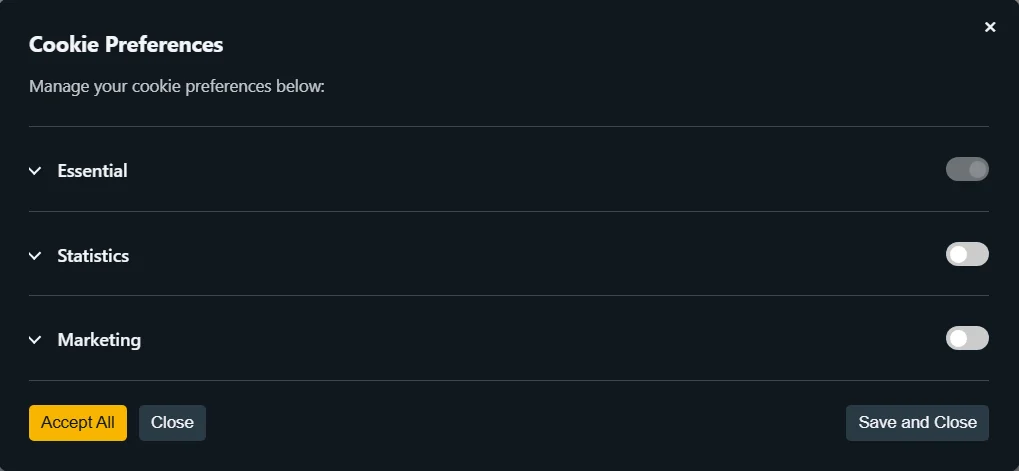
The panel’s buttons reuse the three button property pairs rather than having their own:
--wpconsent-accept-bgand--wpconsent-accept-colorstyle the panel’s Accept All button.--wpconsent-cancel-bgand--wpconsent-cancel-colorstyle its Close button.--wpconsent-preferences-bgand--wpconsent-preferences-colorstyle its Save and Close button.
That is why the panel above matches the banner without a second rule.
One property belongs specifically to this panel:
--wpconsent-outline-colordraws the horizontal rules that separate the category rows.
WPConsent sets that one from your saved text color at reduced opacity, so on a dark panel those rules can come out fainter than you want. Setting it explicitly gives you the separation back:
#wpconsent-container { --wpconsent-outline-color: rgba(248, 181, 0, 0.35); }
Our guide on the preferences panel covers what each row does.
Two surfaces do sit outside this cascade, and each takes a short rule of its own.
Restyling the Floating Settings Button
The floating settings button is the small round control that lets visitors reopen their choices after the banner has gone. It carries its colors directly rather than through the custom properties, so the color rule above leaves it alone. It also has no position setting anywhere in the admin.
WPConsent exposes it to your stylesheet under the name wpconsent-settings-button, which you reach with the ::part() selector. This rule moves it to the bottom right, rounds it into a circle, gives it a deeper shadow, and recolors it:
#wpconsent-container::part(wpconsent-settings-button) {

  left: auto;

  right: 28px;

  bottom: 28px;

  padding: 16px;

  border-radius: 999px;

  box-shadow: 0 4px 14px rgba(16, 24, 32, 0.35);

  background-color: #f8b500 !important;

}

Note the !important on the background color and only on the background color. WPConsent writes that one value straight onto the button so it can follow your saved banner colors, and !important is what lets your rule take precedence. Position, padding, corners, and shadow all take effect without it.
The button’s icon is chosen in the admin rather than in CSS, and our guide on the floating consent button covers picking it. The last surface is the one your visitors meet on your pages rather than in a corner.
Matching Your Blocked Content Placeholders
When content blocking is turned on, an embed that a visitor has not consented to is replaced with a placeholder carrying its own accept button. That button reuses two properties you have already met:
--wpconsent-accept-bgis the placeholder button’s background.--wpconsent-accept-coloris its text.
The placeholder lives out on your page rather than inside the consent container, so it needs both properties set where it can see them.
Scoping the rule to the placeholder itself is the tidiest way to do that:
.wpconsent-iframe-placeholder {

  --wpconsent-accept-bg: #f8b500;

  --wpconsent-accept-color: #101820;

}
The placeholder button then matches the accept button on your banner.

Repeating the two values in a second rule is deliberate: the placeholder and the banner are separate parts of the page, and keeping them in separate rules is what lets you give the placeholder a different treatment if you want one. Our guide on content blocking and placeholders covers turning the feature on and choosing the placeholder text.
That covers all four surfaces, which leaves the properties themselves.
Looking Up Every Available Property
Here is every custom property WPConsent’s consent interface reads, grouped by what it controls. All of them go on #wpconsent-container.
Color Properties
These take their starting values from the Style tab, so a rule here overrides what you saved there.
--wpconsent-backgroundis the panel background, on both the banner and the preferences panel.--wpconsent-textis the body text color, and also the color of the language switcher’s icon when you have more than one language enabled.--wpconsent-outline-coloris the horizontal rule between category rows in the preferences panel, which WPConsent sets from your text color at reduced opacity.--wpconsent-accept-bgand--wpconsent-accept-colorare the Accept All button’s background and text.--wpconsent-cancel-bgand--wpconsent-cancel-colorare the Reject button’s background and text, shared with the panel’s Close button.--wpconsent-preferences-bgand--wpconsent-preferences-colorare the Preferences button’s background and text, shared with the panel’s Save and Close button.
Layout and Type Properties
These have no field in the admin, so CSS is the only way to set them.
--wpconsent-border-radiusis the corner rounding on the banner panel.--wpconsent-shadowis the drop shadow behind the panel, and takes any validbox-shadowvalue includingnone.--wpconsent-paddingis the space between the panel’s edge and its contents, and takes any validpaddingvalue.--wpconsent-min-widthis the narrowest the banner panel is allowed to be.--wpconsent-font-sizeis the notice text size, which the Style tab also sets.--wpconsent-line-heightis the line spacing of the notice text.--wpconsent-borderis the border color on the language switcher’s dropdown, and applies when you have more than one language enabled on a paid version.--wpconsent-z-indexis the stacking order of the consent interface, for sites where another fixed element sits over the banner.
Close Button and Focus Properties
These apply to the banner’s close icon and to the focus ring keyboard visitors see.
--wpconsent-close-sizeis the size of the banner’s close icon, on banners that show one.--wpconsent-close-coloris the color of that icon.--wpconsent-focus-outline-coloris the focus ring color on buttons and checkboxes.--wpconsent-focus-outline-widthis that ring’s thickness.--wpconsent-focus-outline-offsetis the gap between the ring and the element it surrounds.
That’s it! You now know how to restyle every surface of the WPConsent consent interface from your own stylesheet. For the settings you can change without writing any CSS at all, take a look at our guide on banner layout options.
Frequently Asked Questions
Why doesn’t my theme CSS change the banner?
The consent interface is drawn inside a shadow root with its own private stylesheet, so selectors that match the banner’s inner elements never reach them from outside. The custom properties are the supported route in, and the ::part() selector covers the floating settings button. See the How Does WPConsent Expose Its Banner Styles? section above.
Can I put the rule on :root instead?
Not for the banner. WPConsent sets its own values on a wrapper further down the page than html, so a :root rule loses to them no matter what specificity you give it. Blocked content placeholders are the one exception, and scoping to .wpconsent-iframe-placeholder handles those more precisely anyway.
Do I need !important on these rules?
Only on the floating settings button’s background-color and color, because WPConsent writes those two values onto the button itself. Every custom property on #wpconsent-container takes effect without it, as does everything else in the ::part() rule.
Will my CSS survive a plugin update?
Yes. The rules live in your theme or your CSS plugin rather than in WPConsent, so updating the plugin leaves them alone. Custom properties are also the interface WPConsent publishes for this purpose, which makes them the most stable thing to target.
Does the preferences panel need its own rule?
No. It is drawn inside the same container as the banner and reuses the same properties, so a single rule on #wpconsent-container restyles both. See the Restyling the Preferences Panel section above.
Can I change the icon on the settings button with CSS?
The icon comes from the Button Icon grid on the Style tab, which also lets you upload your own image. That grid is where to change it, and our guide on the floating consent button walks through it.
What values do the properties start from?
The color and font size properties start from whatever you saved on the Style tab, which is why the Finding the Values Your CSS Overrides section shows you that panel first. The layout, close button, and focus properties come from WPConsent’s own stylesheet, and your browser’s developer tools show you their current values on #wpconsent-container.
Will these rules work on every banner layout?
The color, font size, and line height properties apply to every layout. These four shape the panel, so they are for the Floating and Modal layouts, which draw the banner as a card:
--wpconsent-border-radius--wpconsent-shadow--wpconsent-padding--wpconsent-min-width
The Long layout draws a full-width bar and sets its own corners, shadow, and spacing to suit that shape. Our guide on banner layout options covers the layouts.