
Are the CSS rules in your theme having no effect at all on your cookie banner? All you need is somewhere on your site to keep a few lines of CSS.
This guide covers where WPConsent keeps its styles, which selectors reach them, and where to put your own rules.
Table of contents
- Why Doesn’t Your Theme’s CSS Change the Banner?
- Adding Your CSS to WordPress
- Styling the Banner From Outside the Shadow Root
- Reaching Banner Elements With ::part()
- Styling the Cookie Policy Page
- Styling Your Blocked Content Placeholders
- Picking the Right Selector
- Frequently Asked Questions
Before you get started, make sure WPConsent is installed and activated on your WordPress site.
Why Doesn’t Your Theme’s CSS Change the Banner?
WPConsent builds the consent banner and the preferences panel inside a shadow root. A shadow root is a self-contained mini document attached to one element on your page.
That mini document carries its own stylesheet, and the boundary around it works in both directions. WPConsent’s button styles never leak out onto your site, and your site’s styles never reach in.
This is why a rule such as .wpconsent-banner { background: black } appears to be ignored. It is not being outranked by something more specific. The selector has nothing to match, because the element it names sits on the other side of the boundary.
Adding !important changes nothing, and neither does piling on extra selectors such as html .wpconsent-banner. Targeting the buttons or the preferences panel directly makes no difference either.
The same boundary explains something else you may have noticed. WPConsent’s banner stylesheet is not listed alongside your theme’s in your browser’s developer tools. WPConsent loads it from inside the shadow root instead.
Three things do cross the boundary, and each has its own section or its own guide:
- Inherited properties set on the container. This is the only route that uses ordinary CSS, and the section after next covers it.
- CSS custom properties. These are how WPConsent publishes its colors, spacing, corners, and type sizes for you to override.
- The
::part()selector. This reaches the individual elements WPConsent exposes by name, including the floating settings button. The Reaching Banner Elements With ::part() section names every one of them.
Note: Our guide on customizing the banner with CSS variables names every custom property. The section on ::part() below names every element WPConsent exposes.
The rest of WPConsent is a different story. Your cookie policy page, your blocked content placeholders, and the preferences button are all ordinary page content. No shadow root goes anywhere near them, so they take ordinary CSS.
Those three make up most of this guide, and the first question is where the rules go.
Adding Your CSS to WordPress
To get started, we’ll find a home for your rules. They belong wherever you already keep your site’s custom CSS. WordPress has a built-in place for exactly this, and it is the one we recommend.
From your WordPress admin, go to Appearance » Customize. From here, open Additional CSS and paste your rule into the editor.
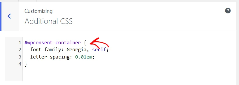
Changes made in the Customizer reach your visitors once they are published. Until then, the banner keeps its current look.
A child theme’s stylesheet works too, as does a CSS snippet in a code snippet plugin. There is one practical reason to prefer Additional CSS though.
WordPress prints Additional CSS after every plugin stylesheet. So when your rule and one of WPConsent’s own rules are equally specific, yours takes precedence.
A theme stylesheet is printed earlier in the page than WPConsent’s, so from there the same rule can lose that tie. The fix is a single extra selector, which raises your rule above the plugin’s whatever the load order. Every placeholder example further down is written that way, so it works from any of the three locations.
WPBeginner’s guide to adding custom CSS in WordPress compares the three locations in more detail.
With somewhere to put a rule, the banner itself is the first place to try one.
Styling the Banner From Outside the Shadow Root
One family of CSS properties crosses a shadow boundary by design: the inherited ones, such as font-family. WPConsent’s stylesheet starts the shadow root by resetting everything and then re-enabling font inheritance. That is why the banner already picks up the typeface your page uses.
Here is that banner before any custom CSS.
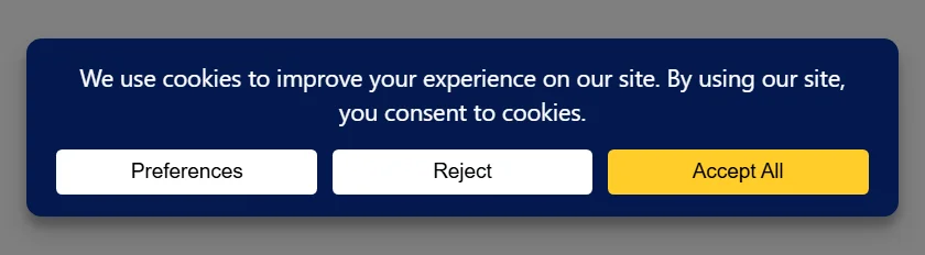
A rule on the container replaces what the banner inherits, and the value passes down to everything inside it:
#wpconsent-container {

  font-family: Georgia, serif;

  letter-spacing: 0.01em;

}
The notice text picks up the new typeface straight away. The letter spacing is a fine adjustment rather than a visible change. It is there to show that a second inherited property travels the same way.
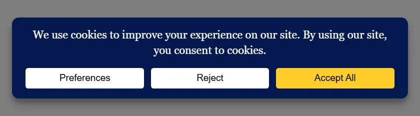
The three buttons keep their original font. That is browsers rather than WPConsent: a <button> gets its own typeface from the browser’s built-in stylesheet. The next section covers the selector that does reach them.
letter-spacing, text-transform, font-weight, and font-style all reach the banner from the container in the same way. Colors, backgrounds, padding, and corner radius do not, because those properties are not inherited. Those are what the custom properties are for.
Note: Put the rule on #wpconsent-container rather than on :root or html. A :root rule looks like the obvious choice and does nothing here. WPConsent’s own values, and your theme’s font-family on body, both sit closer to the banner than html does.
That is the whole of what ordinary CSS can do to the banner. One more selector reaches inside it, and it is the answer to those three buttons.
Reaching Banner Elements With ::part()
WPConsent gives most of the elements inside its shadow root a public name. A name is something your stylesheet can select even across the boundary, using the ::part() selector.
The selector is always the container, then the name of the element you want:
#wpconsent-container::part(wpconsent-button-accept) { font-family: Georgia, serif; }
This is what reaches the three buttons that kept their browser font in the previous section. Naming all three puts them into the same serif face as the notice text, in small uppercase lettering:
#wpconsent-container::part(wpconsent-button-accept),

#wpconsent-container::part(wpconsent-button-cancel),

#wpconsent-container::part(wpconsent-button-preferences) {

  font-family: Georgia, serif;

  text-transform: uppercase;

  letter-spacing: 0.06em;

}
Each name reaches one kind of element, and an element WPConsent has not named cannot be reached this way at all. The rest of this section is every name there is, grouped by where it sits.
Note: For colors, spacing, corners, and type sizes, the custom properties are the shorter route, and one rule on the container covers the banner and the panel together. Reach for ::part() when you want a property the custom properties do not carry, or when you want one element to differ from the rest.
Banner Parts
wpconsent-banneris the banner itself, whichever layout you have it set to.wpconsent-banner-bodyis the block holding your cookie notice text.wpconsent-banner-footeris the row holding the buttons.wpconsent-banner-logois the logo image, and appears only once you have set a logo in your banner settings.wpconsent-button-accept,wpconsent-button-cancel, andwpconsent-button-preferencesare the Accept, Reject, and Preferences buttons.
Preferences Panel Parts
wpconsent-preferences-modalis the panel’s outermost element, andwpconsent-preferences-contentis the card inside it.wpconsent-preferences-headeris the strip across the top, carryingwpconsent-preferences-titlefor the heading andwpconsent-preferences-closefor the close control.wpconsent-preferences-descriptionis the intro text below the header.wpconsent-preferences-accordionwraps every category row.wpconsent-preferences-actionsis the footer, withwpconsent-preferences-buttonsfor the button row inside it.wpconsent-preferences-buttons-leftis the left-hand group of that row, which holds Accept All and Close. The save button sits outside it.wpconsent-preferences-accept-button,wpconsent-preferences-cancel-button, andwpconsent-preferences-save-buttonare the panel’s Accept All, Close, and Save and Close buttons.
Category and Service Row Parts
Every expandable row in the panel shares one set of names, whether it is a category or a single service:
wpconsent-accordion-itemis any one row.wpconsent-accordion-headeris the strip you click, andwpconsent-accordion-toggleis the control on it.wpconsent-accordion-contentis the area that opens underneath.wpconsent-checkbox-toggleis the on-or-off switch on a row. A row that visitors cannot switch off, such as essential cookies, carrieswpconsent-checkbox-toggle-disabledas well.wpconsent-cookie-policy-itemis the row linking to your cookie policy, and appears only once you have chosen a cookie policy page.
Two of the names are built from your own content, so they vary by site:
wpconsent-category-plus the category slug names one category row, such aswpconsent-category-marketing.wpconsent-service-plus the service slug names one service row, such aswpconsent-service-google-analytics.
Those two are what to use when you want one category or one service to look different from the rest.
Cookie Table Parts
Expanding a row reveals the cookies it covers, in a small table of its own:
wpconsent-cookies-listis the table.wpconsent-cookies-list-headeris its header row.wpconsent-cookies-list-itemis each cookie listed under it.
Floating Settings Button Part
wpconsent-settings-buttonis the small round control that reopens the panel after the banner has gone.
That one is worth a mention on its own, because it is the only part whose background color needs !important to change. Our guide on customizing the banner with CSS variables covers moving and recoloring it.
Everything from here on is a part of WPConsent that sits out on your pages. There, CSS behaves the way it does everywhere else.
Styling the Cookie Policy Page
Your cookie policy page is built by a shortcode and rendered as ordinary page content. There is no boundary to work around.
Here is what one of its tables looks like with only WPConsent’s own styling on it.
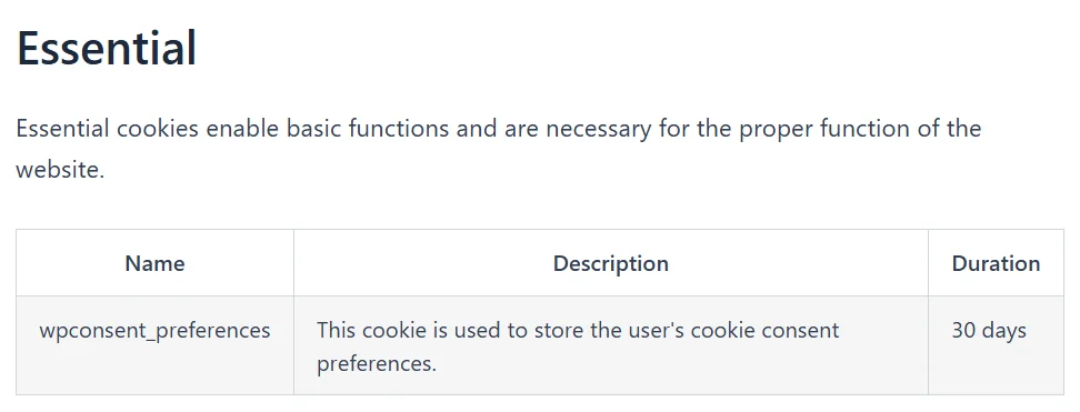
Six classes cover everything the shortcode outputs:
.wpconsent-cookie-policywraps the whole output..wpconsent-cookie-category-nameis the heading for each cookie category, with.wpconsent-cookie-category-descriptionfor its intro text..wpconsent-cookie-service-nameand.wpconsent-cookie-service-descriptiondo the same job for each service inside a category..wpconsent-cookie-policy-tableis every table on the page.
This rule gives the tables a dark header row, tidier borders, and a warmer stripe on alternate rows:
.wpconsent-cookie-policy-table th {

  background-color: #101820;

  color: #f8b500;

  text-align: left;

  text-transform: uppercase;

  letter-spacing: 0.06em;

  font-size: 13px;

}
.wpconsent-cookie-policy-table th,
.wpconsent-cookie-policy-table td {
border-color: #d8dde2;
padding: 12px 14px;
}
.wpconsent-cookie-policy-table tbody tr:nth-child(odd) td {
background-color: #fbf7ec;
}
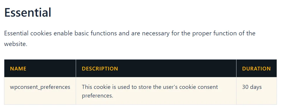
Nothing in that rule needs !important, and this is deliberate on WPConsent’s part. Its own cookie policy rules carry no specificity at all, purely to set a starting look that any rule of yours can replace.
Your theme’s table styling wins for the same reason. That is why a policy page takes on the look of the rest of your site before you touch it.
Our guide on the cookie policy page covers generating the page and keeping it up to date.
The other surface your visitors meet on your pages is what appears in place of a blocked embed.
Styling Your Blocked Content Placeholders
When content blocking is turned on, an embed that a visitor has not consented to is replaced with a placeholder. That placeholder is ordinary page markup as well, so it takes ordinary CSS.

A placeholder is four elements:
.wpconsent-iframe-placeholderis the outer box that takes the place of the embed..wpconsent-iframe-thumbnailholds a preview image of the blocked content..wpconsent-iframe-overlay-contentcovers the whole box and centers the button. This is the element to use when you want a tint over the preview..wpconsent-iframe-accept-buttonis the button itself.
This rule rounds the box, drains the color out of the preview, drops a tint over it, and turns the button into a pill:
.wpconsent-iframe-placeholder {

  border: 2px solid #d8dde2;

  border-radius: 12px;

}
.wpconsent-iframe-placeholder .wpconsent-iframe-thumbnail img {
filter: grayscale(1);
}
.wpconsent-iframe-placeholder .wpconsent-iframe-overlay-content {
background-color: rgba(16, 24, 32, 0.55);
}
.wpconsent-iframe-placeholder .wpconsent-iframe-accept-button {
padding: 14px 26px;
border-radius: 999px;
font-size: 16px;
font-weight: 600;
box-shadow: 0 4px 14px rgba(16, 24, 32, 0.35);
}

Each of the last three rules names the placeholder as well as the element inside it. That is the extra selector mentioned earlier. It lets the rule work from a child theme stylesheet as well as from Additional CSS.
Targeting one service at a time is possible too. Every placeholder carries a second class naming the service it replaced, such as .wpconsent-iframe-placeholder-google-maps. It also carries data-wpconsent-name and data-wpconsent-category attributes.
A selector such as [data-wpconsent-category="marketing"] .wpconsent-iframe-accept-button reaches every marketing placeholder on your site and leaves the rest alone.
The button’s background and text color are the one thing to change elsewhere. They come from the same two custom properties as the banner’s Accept All button, so the CSS variables guide is where to set them.
Our guide on content blocking and placeholders covers turning the feature on and choosing the placeholder wording.
That covers all three surfaces, which leaves the question of how to find a selector for yourself.
Picking the Right Selector
The cookie policy classes, the placeholder classes, and the preferences button all behave like ordinary elements in your browser’s inspector. The class you need sits right there on the highlighted markup.
The banner behaves differently, and it is worth knowing what you are looking at. Inspecting it shows #wpconsent-container with a #shadow-root (open) line nested inside. Expanding that reveals the whole banner, class names and all.
Those class names are real, and the inspector will show you the styles on them. A rule written against them in your stylesheet still will not reach them. The tree is a way to understand what the banner is made of, not a way to style it.
Here is every WPConsent element that sits outside the shadow root, in one place:
#wpconsent-containeris the element the banner is attached to, and the target for inherited properties and custom properties..wpconsent-cookie-policyand the five classes inside it are the cookie policy page..wpconsent-iframe-placeholderand the three classes inside it are the blocked content placeholders..wpconsent-open-preferencesis the button WPConsent’s preferences shortcode outputs, wherever you have placed it.
That last one takes its look from your theme, the way any other button on your pages does. A short rule gives it a look of its own:
.wpconsent-open-preferences {

  background-color: #101820;

  color: #f8b500;

  border-radius: 999px;

  padding: 12px 22px;

}
Our guide on opening the preferences panel with a custom link covers adding that button to a page or a menu.
That’s it! You now know which of WPConsent’s parts take ordinary CSS, which need a different route, and where to keep the rules. To change the banner’s colors, spacing, and corners, take a look at our guide on customizing the banner with CSS variables.
Frequently Asked Questions
Below, we’ve answered some of the most common questions about styling WPConsent with your own CSS.
Why is my rule on .wpconsent-banner ignored?
That element lives inside a shadow root, so a selector in your stylesheet has nothing to match. This holds however specific you make the selector, and whether or not you add !important. The Why Doesn’t Your Theme’s CSS Change the Banner? section above covers what to use instead.
Can I put the rule on :root instead?
Not for the banner. Your theme declares inherited properties such as font-family on body, which sits closer to the banner than html does. WPConsent’s own custom property values sit closer still, so use #wpconsent-container.
Do I need !important on any of these rules?
No. None of the examples in this guide uses it, including the cookie policy and placeholder rules. The one place it is genuinely needed is the floating settings button’s background color, which the CSS variables guide covers.
Can I style the banner’s close icon with ::part()?
No. The close icon is the one banner element WPConsent does not give a public name to, so there is no part to select. Its size and color come from two custom properties instead, which our guide on customizing the banner with CSS variables covers.
Where should I keep the CSS?
Appearance » Customize » Additional CSS is the simplest option. WordPress prints it after plugin stylesheets, so your rules win any tie on specificity. A child theme stylesheet or a code snippet plugin works as well, with one extra selector added to any rule that ties.
Will my CSS survive a plugin update?
Yes. The rules live in your theme, the Customizer, or your snippet plugin rather than inside WPConsent. Updating the plugin leaves them alone.
Can I change the banner’s wording with CSS?
The wording is a setting rather than something to style, and WPConsent has fields for all of it. Our guide on banner content and text walks through the notice, the button labels, and the panel headings.
Where do I find WPConsent’s banner stylesheet?
It is loaded from inside the shadow root rather than in the page itself. The WPConsent stylesheets you will see in the page are the one for blocked content placeholders and the one for cookie policy tables. The cookie policy one loads only on pages that carry the shortcode.
Do I need a paid license for any of this?
No. The shadow root, the container selector, the cookie policy classes, and the placeholder classes work the same at every license level. Every rule in this guide applies to any WPConsent site.